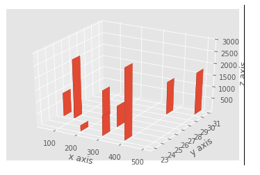
from mpl_toolkits.mplot3d import axes3d
import matplotlib.pyplot as plt
import numpy as np
from matplotlib import style
style.use(‘ggplot’)
import pandas as pd
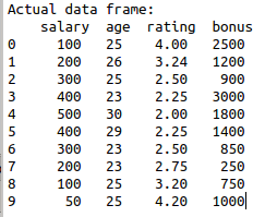
#sample data set
data={‘salary’:[100,200,300,
400,500,400,300,200,100,50],
‘age’:[25,26,25,23,30,29,23,
23,25,25],’rating’:[4,3.24,2.5
,2.25,2,2.25,2.5,2.75,3.2,4.2],
‘bonus’:[2500,1200,900,3000,1800,
1400,850,250,750,1000]}
#create data frame
df=pd.DataFrame(data)
print(“Actual data frame:\n”,df)
#figure object initialization
fig = plt.figure()
ax1 = fig.add_subplot(111, projection=’3d’)
#arguments
x3 = (df[‘salary’])
y3 = (df[‘age’])
z3 = (df[‘rating’])
#arguments
dx = np.ones(10)
dy = np.ones(10)
dz = (df[‘bonus’])
#bar chart object and arguments
ax1.bar3d(x3, y3, z3, dx, dy, dz)
#set axis lables
ax1.set_xlabel(‘x axis’)
ax1.set_ylabel(‘y axis’)
ax1.set_zlabel(‘z axis’)
plt.show()