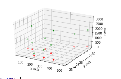
#import 3D tools and objects
from mpl_toolkits.mplot3d import axes3d
#import matplot library
import matplotlib.pyplot as plt
import pandas as pd
#sample data set
data={‘salary’:[100,200,300,400,500,400,
300,200,100, 50],’age’
:[25,26,25,23,30,29,23,23,25,25],
‘rating’:[4,3.24,2.5,2.25,2,2.25,2.5,
2.75,3.2,4.2],’bonus’
:[2500,1200,900,3000,1800,1400
,850,250,750, 1000]}
#store in a data frame
df=pd.DataFrame(data)
#initialize the figure object
fig = plt.figure()
ax1 = fig.add_subplot(111, projection=’3d’)
#passing the variables in to
corresponding axis
x = df[‘salary’]
y = df[‘age’]
z = df[‘bonus’]
a = df[‘rating’]
#3D scatter plot
ax1.scatter(x, y, z, c=’g’, marker=’o’)
ax1.scatter(x, y, a, c=’r’, marker=’o’)
ax1.set_xlabel(‘x axis’)
ax1.set_ylabel(‘y axis’)
ax1.set_zlabel(‘z axis’)
plt.show()