Research Breakthrough Possible @S-Logix
Office Address
- 2nd Floor, #7a, High School Road, Secretariat Colony Ambattur, Chennai-600053 (Landmark: SRM School) Tamil Nadu, India
- pro@slogix.in
- +91-81240 01111
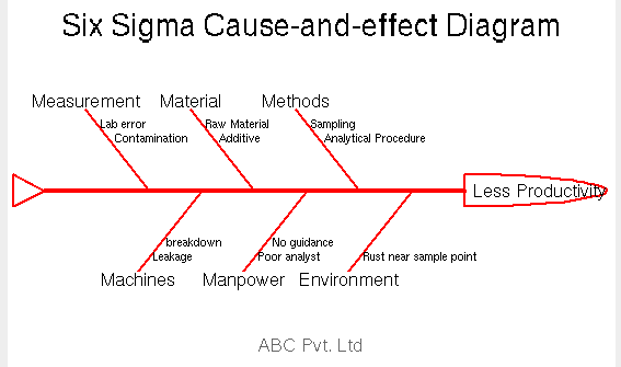
How to plot a Cause and Effect Diagram using R programming.
Name the main problem or event.
This usually goes at the head of the "fish" in your diagram.
Make categories for causes and create the "bone structure" of your fish.
Common categories include: people, methods, measurements, materials, machines and environment
List possible causes under each category including variations in a process or design.
Insert your completed fishbone diagram into any report or presentation.
R Package : SixSigma
R Function : ceDiag()
#Cause and Effect Diagram or Fish- bone Sample
#install.packages(“qcc”)
library(“qcc”)
#Effect
effect<-“Less Productivity”
#Causes
causes.head<-c(“Measurement”, “Material”, “Methods”, “Environment”, “Manpower”, “Machines”)
#Individual Causes
causes<-vector(mode = “list”, length = length(causes.head))
causes[1]<-list(c(“Lab error”, “Contamination”))
causes[2]<-list(c(“Raw Material”, “Additive”))
causes[3]<-list(c(“Sampling”, “Analytical Procedure”))
causes[4]<-list(c(“Rust near sample point”))
causes[5]<-list(c(“Poor analyst”,”No guidance”))
causes[6]<-list(c(“Leakage”, “breakdown”))
#Fishbone Diagram
#install.packages(“SixSigma”)
library(“SixSigma”)
ss.ceDiag(effect,causes.head,causes,sub=”ABC Pvt. Ltd”,ss.col = c(“”,”red”))