Research Breakthrough Possible @S-Logix
Office Address
- 2nd Floor, #7a, High School Road, Secretariat Colony Ambattur, Chennai-600053 (Landmark: SRM School) Tamil Nadu, India
- pro@slogix.in
- +91-81240 01111
To analyse the SLID Datset using MLR model and Clustering techniques using R.
#Import Data
my_input<-read.csv(“SLID.csv”)
my_input1<-my_input
View(my_input)
str(my_input)
#Labelling Data
library(“plyr”)
nlevels(my_input$gender)
levels(my_input$gender)
levels(my_input$gender)
nlevels(my_input$language)
levels(my_input$language)
my_input$language<-mapvalues(my_input$language,
from=c(“English”,”French”,”Other”),to = c(0:2))
View(my_input)
#Data Preparation
#Number of Missing Values
sum(is.na(my_input))
#Checking for Missing Values
sapply(my_input, function(x)sum(is.na(x)))
#Recoding wages and education with mean
my_input$wages[is.na(my_input$wages)]<-mean(my_input$wages,na.rm = T)
my_input$education[is.na(my_input$education)]<-mean(my_input$education,na.rm = T)
#Recoding language with mode
mode<-function(f){
uni<-unique(f)
uni[which.max(tabulate(match(f,uni)))]
}
my_input$language[is.na(my_input$language)]<-mode(my_input$language)
sapply(my_input, function(x)sum(is.na(x)))
#Check Outliers
library(“plotly”)
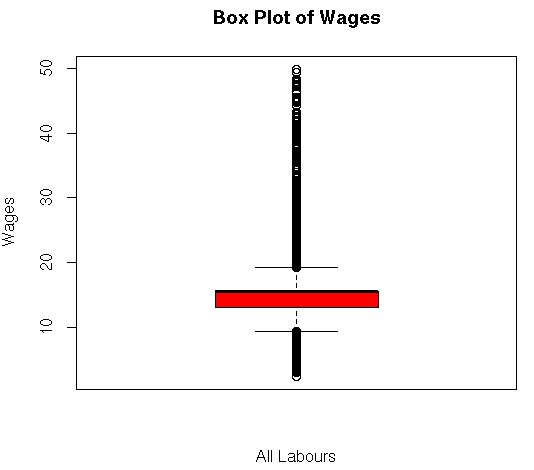
boxplot(my_input$wages,main=”Box Plot of Wages”,ylab=”Wages”,xlab=”All Labours”,col = “red”)
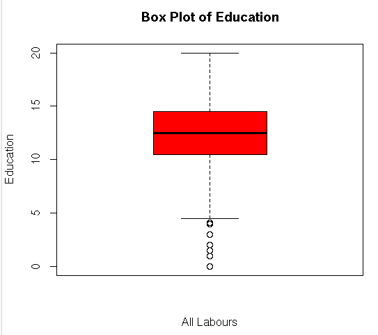
boxplot(my_input$education,main=”Box Plot of Education”,ylab=”Education”,xlab=”All Labours”,col = “red”)
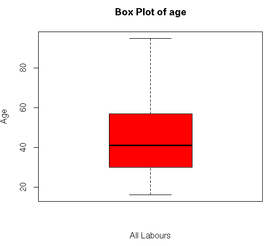
boxplot(my_input$age,main=”Box Plot of age”,ylab=”Age”,xlab=”All Labours”,col = “red”)
#Univariate Plotting
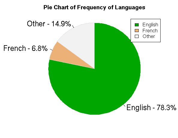
#Pie Chart for Language
tab<-table(my_input1$language)
colors<-terrain.colors(3)
p_tab<-round(prop.table(tab)*100, digits = 2)
prop_tab<-as.data.frame(p_tab)
p_tab
lab<-sprintf(“%s – %3.1f%s”,prop_tab[,1],p_tab,”%”)
pie(p_tab,col =colors,labels = lab, clockwise = T, border = “gainsboro”,radius = 1,cex=1.5,main = “Pie Chart of Frequency of Languages”)
legend(“topright”,legend = prop_tab[,1],fill=colors,cex=1)
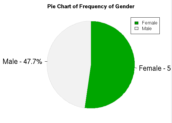
#Pie Chart for Gender
tab1<-table(my_input1$gender)
colors1<-terrain.colors(2)
p_tab1<-round(prop.table(tab1)*100, digits = 2)
prop_tab1<-as.data.frame(p_tab1)
p_tab1
lab1<-sprintf(“%s – %3.1f%s”,prop_tab1[,1],p_tab1,”%”)
pie(p_tab1,col =colors1,labels = lab1, clockwise = T, border = “gainsboro”,radius = 1,cex=1.5,main = “Pie Chart of Frequency of Gender”)
legend(“topright”,legend = prop_tab1[,1],fill=colors1,cex=1)
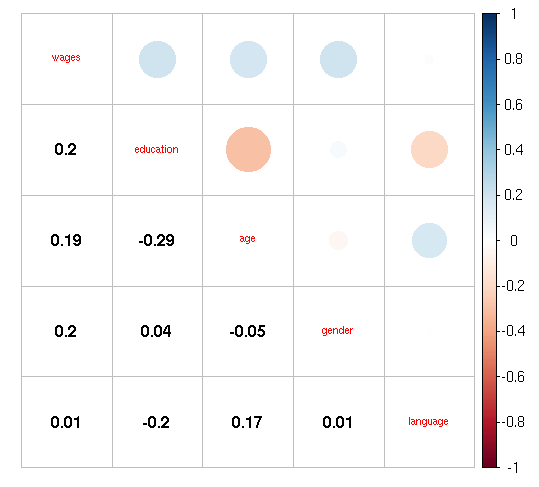
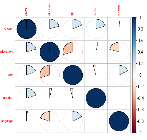
#Bivariate Plot
#install.packages(“corrplot”)
library(“corrplot”)
library(“polycor”)
het<-hetcor(my_input[,-1])
het
corrplot(as.matrix(het),method = “pie”,tl.cex=0.7)
corrplot.mixed(as.matrix(het),tl.cex=0.7,lower = “number”,lower.col = “black”)
#Splitting into train and test
library(“caret”)
training<-createDataPartition(my_input$wages,p=0.7,list=F)
train = my_input[training,]
test = my_input[-training,]
nrow(train)
nrow(test)
#ML Algorithms
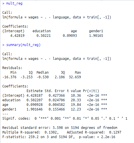
#Multiple Linear Regression Model
mult_reg<-lm(wages~.-language,data=train[,-1])
mult_reg
summary(mult_reg)
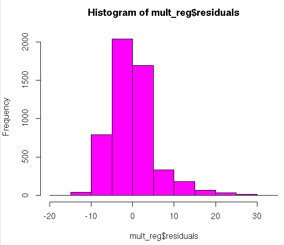
#Check Normality of Residuals
#Histogram
hist(mult_reg$residuals,col=62)
#install.packages(“nortest”)
library(“nortest”)
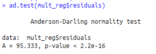
#Anderson – Darling Test
ad.test(mult_reg$residuals)
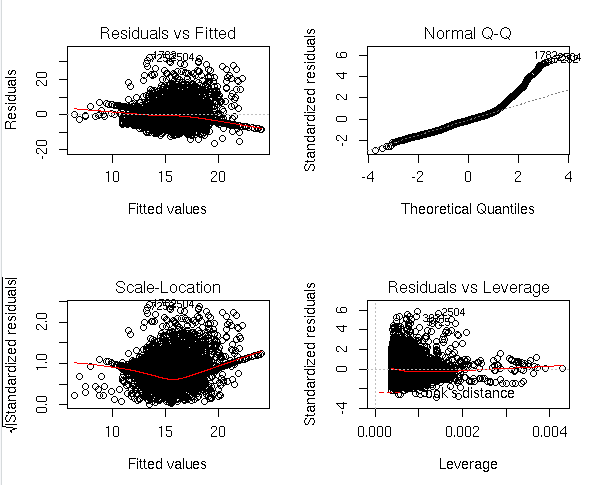
#Regression Diagnostics
par(mfrow = c(2, 2))
plot(mult_reg)
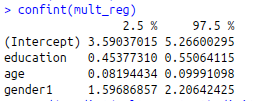
#Confidence Interval
confint(mult_reg)
#Prediction
round(predict(mult_reg,test),digits = 2)
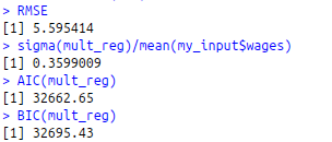
#Validation of the MLR model
RSS<-c(crossprod(mult_reg$residuals))
MSE RMSE<-sqrt(MSE)
RMSE
sigma(mult_reg)/mean(my_input$wages)
#AIC and BIC
AIC(mult_reg)
BIC(mult_reg)
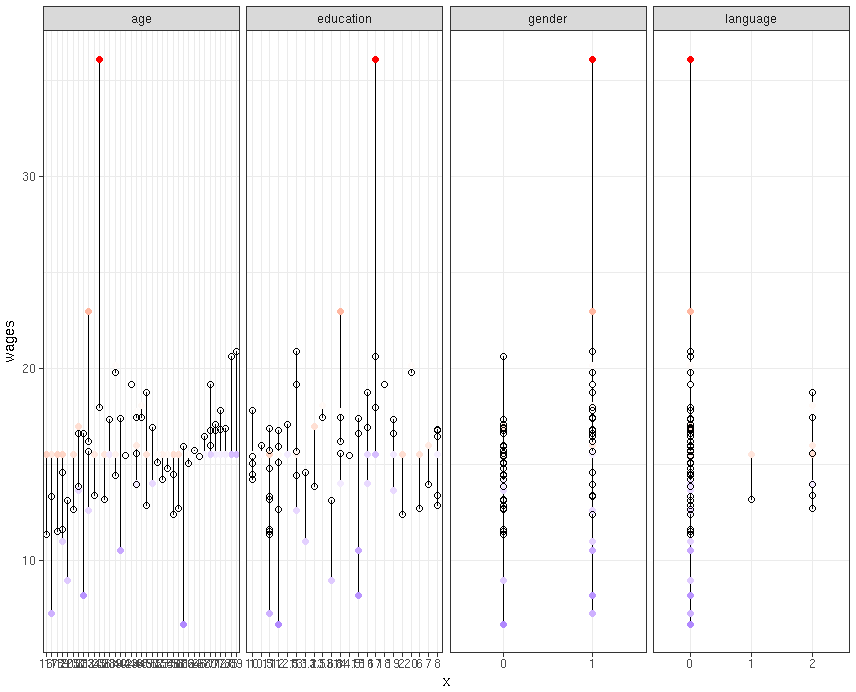
#Actual Predicted Plot
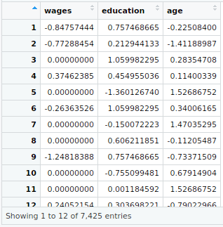
mult_reg1<-lm(wages~.-language,data=my_input[,-1])
my_input$predicted<-predict(mult_reg1)
my_input$residuals<-residuals(mult_reg1) #For Seperate Variables library(“tidyr”) my_input[1:50,-1] %>%
gather(key = “iv”, value = “x”, -wages, -predicted, -residuals) %>% # Get data into shape
ggplot(aes(x = x, y = wages)) + # Note use of `x` here and next line
geom_segment(aes(xend = x, yend = predicted)) +
geom_point(aes(color = residuals)) +
scale_color_gradient2(low = “blue”, mid = “white”, high = “red”) +
guides(color = FALSE) +
geom_point(aes(y = predicted), shape = 1) +
facet_grid(~ iv, scales = “free”) + # Split panels here by `iv`
theme_bw()
#Hierarchical Clustering
#Finding the more appropriate method for more strongest clustering structure
#install.packages(“purrr”)
library(“purrr”)
library(“cluster”)
m names(m)<-c(“complete”,”single”,”ward”,”average”)
agg_coef<-function(x){
agnes(my_input[1:100,],method = x)$ac
}
map_dbl(m,agg_coef)
#Compute hclust
my_input_scale<-scale(my_input[,2:4])
View(my_input_scale)
my_input1<-cbind(my_input_scale,my_input[,c(1,5,6)])
h_dist<-dist(my_input1,method = “euclidean”)
h_data<-hclust(h_dist, method = “ward.D”)
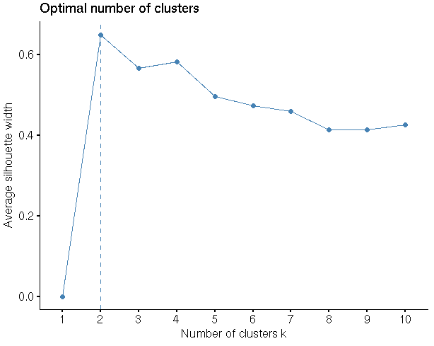
#Finding the optimal No of clusters
library(“factoextra”)
fviz_nbclust(my_input1,hcut,method = “silhouette”)
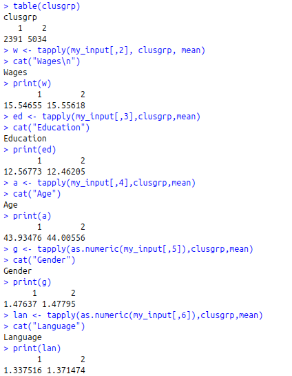
clusgrp<-cutree(h_data,k=2)
table(clusgrp)
w<-tapply(my_input[,2], clusgrp, mean)
cat(“Wages\n”)
print(w)
ed<-tapply(my_input[,3],clusgrp,mean)
cat(“Education”)
print(ed)
a<-tapply(my_input[,4],clusgrp,mean)
cat(“Age”)
print(a)
g<-tapply(as.numeric(my_input[,5]),clusgrp,mean)
cat(“Gender”)
print(g)
lan<-tapply(as.numeric(my_input[,6]),clusgrp,mean)
cat(“Language”)
print(lan)