Condition for Visualizing Data Using Line Graph in Python
Description:
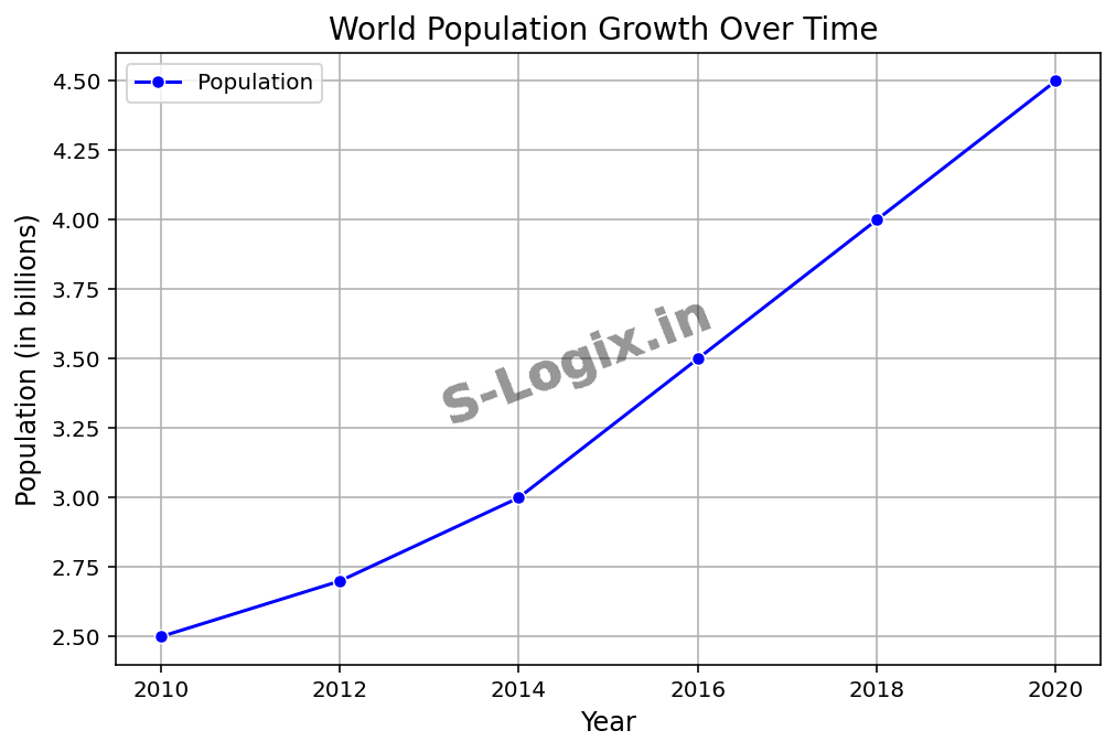
A line graph is a type of chart used to visualize data points connected by a straight or smooth line. It is especially effective for showing trends over time, relationships between variables, or changes in values across a sequence.
Step-by-Step Process
Import Libraries:
Import Matplotlib and Seaborn for enhanced aesthetics.
Prepare Data:
Ensure your data is in a format suitable for plotting.
Create the Plot:
Use the plot() function from Matplotlib to create a line graph.
Customize the Graph:
Add labels, titles, legends, grid lines, etc., for clarity and better presentation.
Display the Graph:
Use the show() function to render the plot.
Sample Source Code
# Line-graph plotting
import seaborn as sns
import matplotlib.pyplot as plt
import pandas as pd
plt.title("World Population Growth Over Time ", fontsize=14)
plt.xlabel("Year", fontsize=12)
plt.ylabel("Population (in billions)", fontsize=12)
plt.grid(True)
plt.legend()
 Research Breakthrough Possible @S-Logix