How to Detect Outliers in Independent Variable Using Seaborn
Share
Condition for Detecting Outliers Using Seaborn
Description:
Detecting outliers is an important step in data preprocessing, as outliers can affect the results of statistical analysis and machine learning models.
Seaborn provides visualization tools, such as boxplots and scatter plots, to help identify outliers in datasets.
Steps:
1. Import Required Libraries
2. Create or Load Dataset
3. Visualize Data with Boxplot
4. Visualize Data with Scatter Plot
5. Interpret Outliers
Step-by-Step Process
Import Required Libraries: Import seaborn for visualization, matplotlib for plotting, and pandas for handling datasets.
Create or Load Dataset: Create a dataset (or load an existing one) containing numerical data where you want to detect outliers.
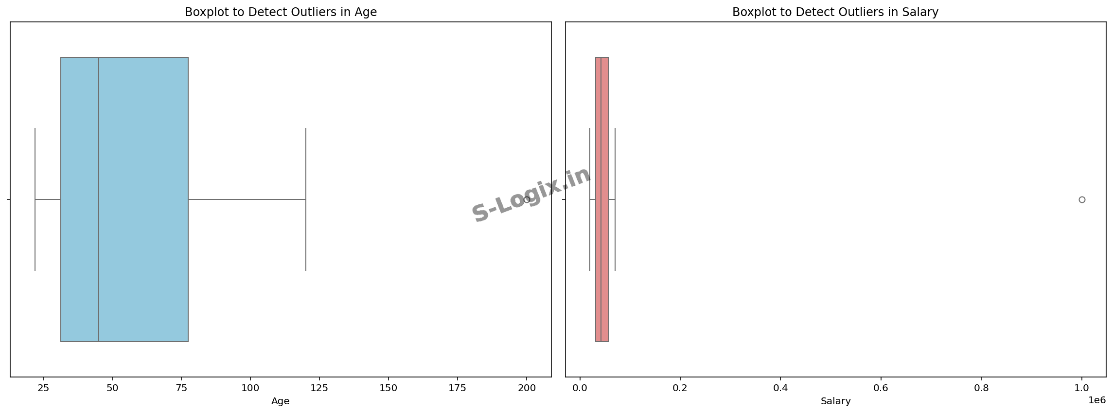
Visualize Data with Boxplot: Use Seaborn’s boxplot to visualize the distribution of the data. Outliers are shown as points outside the "whiskers" of the boxplot.
Visualize Data with Scatter Plot: For detecting outliers when multiple variables are involved, use a scatter plot. Outliers appear as isolated points far from the bulk of the data.
Interpret Outliers: Outliers in the boxplot are points that lie outside the range defined by the "whiskers" (1.5 times the interquartile range above the upper quartile and below the lower quartile).
Sample Source Code
# Code for Detecting Outliers
import seaborn as sns
import matplotlib.pyplot as plt
import pandas as pd
# Set up a 1x2 grid for the plots (2 plots in one row)
fig, axes = plt.subplots(1, 2, figsize=(16, 6)) # 1 row, 2 columns
# Create the boxplot for the 'Age' column on the first subplot
sns.boxplot(x=df['Age'], color='skyblue', ax=axes[0])
axes[0].set_title('Boxplot to Detect Outliers in Age')
axes[0].set_xlabel('Age')
# Create the boxplot for the 'Salary' column on the second subplot
sns.boxplot(x=df['Salary'], color='lightcoral', ax=axes[1])
axes[1].set_title('Boxplot to Detect Outliers in Salary')
axes[1].set_xlabel('Salary')
# Show the combined plots
plt.tight_layout()
plt.show()
 Research Breakthrough Possible @S-Logix